
25.5.10
13.2.10
Production processes.
I havn't been able to update my blog with any new work for the past few months, but here's a little teaser of what I'm working on:
(a pilot show for ITV2 produced by 3rd year Broadcast students at Ravensbourne. The pilot is being filmed with Ant and Dec as the subjects).
(I am currently working on a YCN live brief for Cartoon Network, which encourages children to not only realise the power of their imagination, but do something amazing with it).
All final work will be up in March time, until then, here's the current state of things:


- Fan to Friend
(a pilot show for ITV2 produced by 3rd year Broadcast students at Ravensbourne. The pilot is being filmed with Ant and Dec as the subjects).
- Cartoon Network
(I am currently working on a YCN live brief for Cartoon Network, which encourages children to not only realise the power of their imagination, but do something amazing with it).
All final work will be up in March time, until then, here's the current state of things:


5.12.09
23.11.09
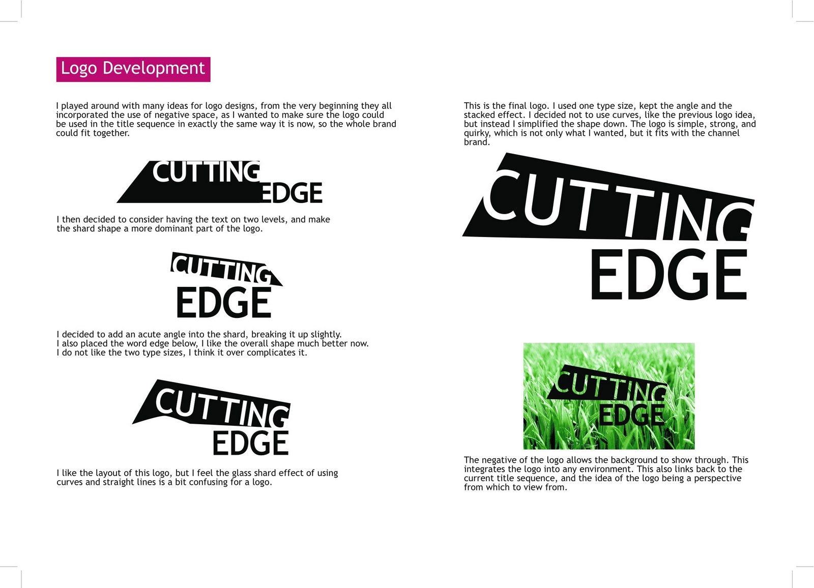
Cutting Edge Promo.
Here is my final 15 second Cutting Edge promo to my Type in Motion brief.
Motion Type Promo from Hannah Newson on Vimeo.
Here are some of the pages from my Progress Report, they explain the project in more detail. (Click to enlarge).


Motion Type Promo from Hannah Newson on Vimeo.
Here are some of the pages from my Progress Report, they explain the project in more detail. (Click to enlarge).


15.10.09
Into the final Year!
I have finished a whole set of illustrations for a friend of mine who has written a child's poetry book called "Phattis Cattis", about a fat cat, his friends and their adventures.
Below are of some of the drawings. I'm not going to put them all up, as there's rather a lot of them. But once my website is complete ,a full example of the book will be available.
(Click to enlarge)

I have also done some work experience with IBC. Myself and a 15 other Ravensbourne students followed up an opportunity to work at the IBC (International Broadcast Conference) in Amsterdam this September. We had a string of interviews where we explained why we wanted the opportunity.
We were flown out to the conference and worked on the front of house as hosts and hostesses representing the company. We represented IBC, as we were responsible for delegates and exhibitioners, helping to guide them around, and make the most of their experience.

I am now writing my Dissertation. The Title is "How does product branding affect consumer purchasing decisions?".
I wanted to orientate it on branding, as this path it'd like to pursue when I graduate.
Below are of some of the drawings. I'm not going to put them all up, as there's rather a lot of them. But once my website is complete ,a full example of the book will be available.
(Click to enlarge)

I have also done some work experience with IBC. Myself and a 15 other Ravensbourne students followed up an opportunity to work at the IBC (International Broadcast Conference) in Amsterdam this September. We had a string of interviews where we explained why we wanted the opportunity.
We were flown out to the conference and worked on the front of house as hosts and hostesses representing the company. We represented IBC, as we were responsible for delegates and exhibitioners, helping to guide them around, and make the most of their experience.
I am now writing my Dissertation. The Title is "How does product branding affect consumer purchasing decisions?".
I wanted to orientate it on branding, as this path it'd like to pursue when I graduate.
PROMAX
At the beginning of the summer I entered the PROMAX competition, the brief was to create an advertising campaign that heightens awareness of the Alzheimer's Society. The restrictions I had to abide by were that it had to be within the current company branding guidelines and I had to create a marque and slogan to engage the general public.
Although I didn't win the competition, I got a personal e-mail from one of the judges saying I was in the final top three. This was one of those e-mails I was grateful to receive, but it must have taken me a few days to digest the frustration that came along with it!
Here are just a few slides from my final presentation.
The first 3 .jpg's are poster campaigs, then the next 3 are web banners, and the final 3 are storyboards for television adverts.
(Click to enlarge).


8.6.09
Rave on Air montage of all our FINISHED work!!
This is a montage of the RoA day, with all our branding work!
23.5.09
Fates Funeral Titles.
Here's the final title sequence for Fates Funeral, which is being broadcast live on this years Rave on Air.
I worked on this project with Alex Blomely. We are really pleased with this project, it looks and feels exactly how we planned it.
Music is from audionetwork.com... a great place for students to get cheap legal soundtracks for things like this!
I worked on this project with Alex Blomely. We are really pleased with this project, it looks and feels exactly how we planned it.
Music is from audionetwork.com... a great place for students to get cheap legal soundtracks for things like this!
16.5.09
4 second RoA sting.
Here's a four second Rave on Air sting to be inserted in between various VT's and animations, to keep exhibition screens on brand on the event day.
13.5.09
Fates Funeral sting.
Here's a four second sting to take the audience into the advert break from Fates Funeral. A live murder mystery programme on Rave on Air.
Alex Blomely and I worked together to create this.
Alex Blomely and I worked together to create this.
28.4.09


23.4.09
Memory Stick advert.
I have been set a brief to come up with an advertising campaign that sells memory sticks to the target market of creative professionals
If I was to change anything about the ad, it would be to have an opening shot of the girl picking up the memory stick off the table before she sets off on her walk, as I feel that an establishing shot of the product is lacked.
Firstly I have posted my initial story board, and then I have posted my final advert:

14.4.09
RTS Flyer

This is the final design for the Rave on Air Flyer to advertise the event as the Royal Television Society exhibition next week. We wanted to keep the design simple and formal, to fit the clientele.
8.4.09
Initial invitation designs.
These are some Rave on Air front cover of invitation designs. We are limited to using four colours, and we want to extend our brand to a more graphical and dynamic approach to the "patchwork" theme. These are some ideas of how this could be applied, however they are not going to be used, as they feel a little too abstract, and less corporate than we would like.


6.4.09
Harvey Milk Speech
Here is a quick motion type project in response the the speech "Hope" by Harvey Milk. I watched the film Milk recently, and I was greatly inspired by it.

5.3.09
Drink for Life - the advert
This is our final peice for the breif. A 30 second television advert for the Drink for Life campaign.
We decided to make a hard hitting and emotionally stimulating ad.
By conducting primary research on people's views on tap/bottled water we realised members of the public seem to believe tap water is unclean and unsuitable to drink, and this is why they buy bottled water.
In response to this, we made our message, and created this:
Drink for Life.
A Contextual Studies brief has asked us to consider an arguement for or against a topic we feel passionately about. My group and I have chosen the subject "tap water". (My group is myself and three other Moving Image Design students, Chris Shone, Yurika Mitsumori and Alex Blomely).
Our mission is to label bottled water as irresponsible, and to cut down the frivolous consumption of it. And also to to promote the usage of tap water and "bringing your own bottle" when going out.
Firstly, this is the logo and slogan for our campaign:
Our mission is to label bottled water as irresponsible, and to cut down the frivolous consumption of it. And also to to promote the usage of tap water and "bringing your own bottle" when going out.
Firstly, this is the logo and slogan for our campaign:

Fates Funeral branding.
Once again I am working with Alex Blomely on this project.
We have set a brief by a thrid year Broadcast student who is making an interactive Murder Mystery programme set in the Victorian era. The programme will be aired on channel 1 on Rave on Air.
For more info about fates funeral visit : http://raveonair.com/programmes/fates-funeral-live-2.php
This is our logo design and D.O.G:
22.2.09
Ident Storyboards.
Here are some storyboards I created for the Rave on Air TV channels.


Channel 1's theme is "perspective" and the idea of seeing things from a fresh perspective. Channel 2's theme is all about "breaking boundaries" and going on an adventure.
Rave on Air Logo
Indeed that statement "Less is more" can be true. |
Me and the the other two people I'm working with to brand Rave on Air 2009 are James Taylor and Alex Blomely. We have realised we don't need to over somplicate the logo, as it can be extended and explored within the rest of that brand.
If you'd like to get a full understanding of Rave on Air, visit the website at www.raveonair.net
(Navigate to - "people", and then, "branding" - to see a bit about each of the branding team.

21.2.09
Rave on Air initial ideas.
Me and my team, James Taylor and Alex Blomely pitched to brand the largest student run broadcast event,Rave on air, and won!
After coming up with the brand DNA; Unity, Individuality, and Aspiration, we needed to generate a logo. This logo concept needed to be a creative springboard that would encapsulate the brand DNA.
The branding theme we decided have on for Rave on Air is "Patchwork". This is a metaphorical solution to representing the work of the students individually, as well as Rave on Air as a whole.
From these initial ideas, here are some preliminary logo designs that we developed, but did not proceed with:

10.2.09
Video experiment
I've been wanting to ply around with shooting footage and compositing animation over the top of it. So here's my first attempt. I shot the fotage of the burlesque dancer in a theater in Battersea. I then added various odds and ends that I feel represent the mood and style of the dancer.
9.2.09

15.1.09
Piss taking is fun!
So we have this subject at uni called "Personal Professional Development" aka, PPD.
It is a bit of a joke really, and they asked us to make a peice of work about the Do's and Don'ts in the workplace. Blah blah.....
There were 5 of us on our group, so we decided that we'd create an underwater office with finger puppet characters. It's ridiculous, but for some bizarre reason we got away with it, and it was one of the better efforts... sigh.
13.1.09
Architecture Sting.
The Arts Show Sting:
(Note bright green background is there to be keyed out in broadcast)
Architecture Sting....
(Note bright green background is there to be keyed out in broadcast)
Architecture Sting....
Comedy Sting.
The Arts Show Sting:
(Note bright green background is there to be keyed out in broadcast)
Comedy Sting....
(Note bright green background is there to be keyed out in broadcast)
Comedy Sting....
12.1.09
The Arts Show
I worked with Alex Blomely again on this project. We were asked to create an opening title sequence for a program called "The Art Show" produced by a fellow student at Ravensbourne called Tom Wisdom, who is a second year Broadcast student.
The show is similar to the Culture show, mainly discussing music, comedy, arts and architecture.
We decided to give the Sequence a flip book style animation which worked well in the progression of the piece. All the images made in Photoshop, except the vector characters, who are made in Illustrator.
We deicded to work with an orange and blue complementary colour scheme, this allowed us to keep it simple, and use balanced layouts.
The music was supplied to us, and we in turn had to consider the animation and transitions in relation to the tempo changes, etc.
Here is our initial Storyboard....

Here is the finished Title Sequence:
Fish!
Our class were each given a 12 section section of the Mr. Scruff song "Fish". We were asked to create an animation to the music we were given, and consider the person's work that came before and after our section, to allow for a smooth transitioning when watching the completed song animation.
I decided the fish chanting sound was repetitive and slightly mechanical, and from this I decided to work on the idea of the mass consumption of fish in the world.
The fish factory in which my animation is set is designed to look grotty and abstract, a fictional place that highlights the mass production of the fish industry.
Ironically the dead fish go through a process which turns them into processed fish shapes, which I thought was a good comment on processed foods. Yucky!!
Type animation.
This is just another piece of experimental After Effects using dialogue from the film Little Miss Sunshine.
11.1.09
Wild Times
I worked on this title sequence with Alex Blomely, another Moving Image Design student. Our brief was set by third year Broadcast students who were making a Children's television show about wildlife. We were asked to create something that engaging that represented British wildlife.
We decided on setting the sequence in a land of clockwork. As the landscape ticks by like a set of cogs, the time of day changes, showing all the various animals who inhabit Great Britain throughout the day.
We created the characters and landscape in Illustrator and then animated the entire thing in After Effects. This is a very old piece of work now, and we both feel a lot more could have been achieved on this project in order to give it more depth.
I also helped design the characters as a part of the set, here are some images from the studio:

 (click to enlarge)
More Rostrum tests
This is an experimental piece of stop frame with sugar and food colouring on glass. I wanted to use the rostrum camera in a more abstract sense and this is what came out of just playing around for hours moving one grain at a time and trying to control the looseness of liquid on a flat surface!
8.1.09
Pixel Painty.


These illustrations are made in Illustrator to create the outlines and structure, and then built up the depth, shadow and tone in Photoshop. I wanted to play around with mixed platforms, playing around with paths and vectors, and using Photoshop brushes to paint digitally.
Cut and Paste.
In class we were all asked to create an animation based on a proverb that we pulled out of a hat.
I had to respond to the proverb "It never rains, but it pours". Which basically means that when you're having a bad day, it will usually end up with a succession of equally bad occurrences happening all day!
I decided a cool theme for this piece would be to set it in the life of a bird... just for comic value really! I've based the story around this scruffy mangy little character who first off drops his supper, then who's life is intruded upon by a Parrot, who he disgusts with his uncleanly feathers! A family of Budgies who torment him with their happy family circumstance, and then finally a Peacock who spreads his luscious tail and pushes the poor guy off his branch into a puddle.
Gutted.....
Rostrum experiment.
This is my second stop frame animation. I filmed this piece using a rostrum camera, which allows you to digitally set the cameras movement as you animate your subject, as you probably know!!
The content is very basic, but i wanted to play with the relationship between the subject and the camera movement. Fun fun fun!
7.1.09
Frame by frame
Cause and Reaction.
I created this little fellow to learn the basic principles of traditional animation.
I used a light box to alter each frame from the next and captured each drawing on a line testing machine.
I created this little fellow to learn the basic principles of traditional animation.
I used a light box to alter each frame from the next and captured each drawing on a line testing machine.
Subscribe to:
Posts (Atom)
